- The PEN Weekly
- Posts
- More money doesn’t mean better education.
More money doesn’t mean better education.
The data is more complicated than we think.
Andre Violante
April 29, 2026 • Estimated Reading Time: 5 minutes

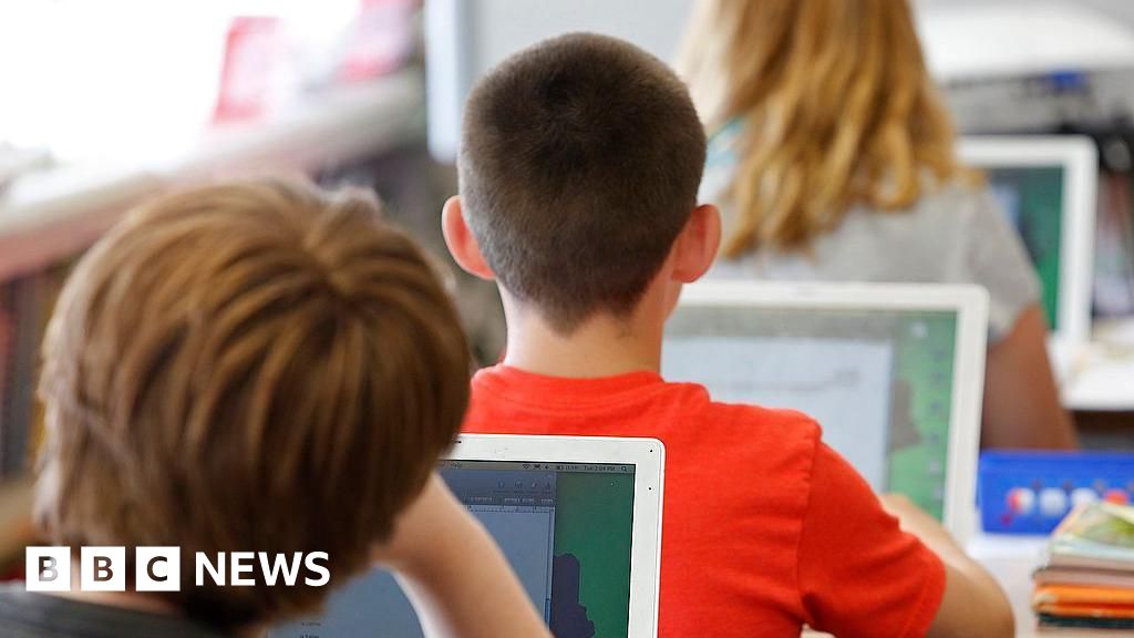
MAKING IT EASIER TO BE A BETTER TEACHER
Every student’s education comes with a price tag.
But what that number actually means (and whether it leads to better learning) is far less clear than we might think.
This week’s Brainy Bit research find looks at how education spending varies around the world, and what that reveals about opportunity, equity, and outcomes.
And this week’s Tech Tool turns space and geography into something students can literally see their place in (hello easy engagement).
You’re about to become an even better teacher in the next 5 minutes.
🔉Are you tired of prompting AI over and over again? Then you’re going to want to check out this week’s sponsor:
Stop re-prompting. Say it right the first time.

Voice-first prompts preserve the nuance you cut when typing. Speak once, paste into any AI tool, get results that don't need a follow-up. 89% of messages sent with zero edits.
And now, back to making you an even better teacher. ⬇️
BRAINY BIT

What global education spending tells us — and what to do with it
Every student has a price tag on their education and depending on where they live, that number might shock you.
TLDR: The OECD's most recent Education at a Glance shows that annual spending per student ranges from just $2,612 in Peru to $31,439 in Luxembourg (a 12x gap) and that raw dollar amounts don't always capture the full picture of a country's commitment to education.
The Study: Education at a Glance
Education at a Glance is the OECD's annual report card on education systems across 43 countries. Researchers collected government-reported data on education spending, enrollment, and outcomes, then standardized everything into USD using purchasing power parity (PPP) — a method that accounts for the fact that a dollar goes further in some countries than others.
To measure investment fairly, the report uses three lenses: raw spending per student, spending as a share of GDP per capita (how much a country spends relative to its average citizen's income), and total education spending as a share of GDP.
This matters because a country can look like a big spender in dollars while actually investing a smaller slice of its economic pie, and vice versa.
The Results:
The OECD average sits at $15,023 per student per year across primary through post-secondary education. Luxembourg tops the chart at $31,439, followed by Norway ($22,558) and Austria ($20,942).
At the bottom: Peru at $2,612, Mexico at $4,066, and South Africa at $4,395. That top-to-bottom gap is nearly 12 times.
Here's where it gets interesting: some lower-spending countries are actually punching above their weight.
Chile spends just $8,068 per student (below the OECD average) but that represents 26% of GDP per capita, above the OECD average of 25%.
Meanwhile, Luxembourg's sky-high per-student number only represents 21.8% of GDP per capita - its wealth is just that enormous.
And if you’re curious where the US and Canada fall, the U.S. ranks 4th globally at $20,387 per student (nearly $5,000 above the OECD average) and is one of only a handful of countries that scores high across every spending measure.
Canada isn't far behind, landing 10th at $18,733 per student, putting both countries firmly in the top quarter of education spenders relative to the rest of the world.
In YOUR Classroom:
This report hands us one of the most engaging real-world datasets we can put in front of students (and fellow teachers) - one that connects math, geography, economics, and social justice in a single chart. And keep in mind, a country’s higher place on this list does not always guarantee a better education is being delivered. Money can help, but it’s not a universal solution.
Here’s how these results can impact your classroom approach this week:
Strategies That Work:
Run a "fair or not fair?" data discussion. Show students the spending-per-student table and ask: does spending more always mean better education? Use the Chile vs. Luxembourg comparison to complicate their first instinct.
Know your numbers, then use your voice. The OECD average is $15,023 per student; if your classroom feels like it's operating below that, you're not imagining it, and this report gives you cited, peer-reviewed data to bring to your next school board meeting.
Let students advocate. Have them write a short letter to a fictional education minister arguing for or against increased spending, using the data as evidence - real argument, real numbers, real stakes.
The price tag on a student's education varies wildly depending on where they were born and your class can absolutely have something to say about that.
🚀 Noteworthy News

:quality(100))
“Tell me and I forget. Teach me and I remember. Involve me and I learn.”
TECH TOOL

NASA's free tool just made geography personal
Artemis II has everyone looking up - and NASA quietly dropped something that brings space technology all the way back to Earth.
Literally.
The Solution: Your Name in Landsat
NASA and space are having a moment right now - so use it. Their free "Your Name in Landsat" tool uses real satellite imagery to find actual landscapes on Earth that form the letters of your name. Type it in. Watch the planet spell it back.
Landsat satellites have been photographing Earth for over 50 years. NASA's team combed through that archive to find real land formations (ridgelines, rivers, craters, coastlines) that naturally resemble each letter of the alphabet. You type any name, and it assembles your personal satellite portrait.
Click any individual letter and it links to the actual location on Earth where that shape exists.
That's where the real learning kicks in: students can explore the geography, climate zone, and landforms of each spot turning a five-second wow moment into a genuine inquiry springboard.
Is This For YOUR Classroom?
This is a warm-up, not a unit plan. It works beautifully as a five-minute hook, but earlier grades may need guidance connecting the satellite imagery to actual geography concepts.
Strategies That Work:
Name Geography Hunt: Students type their name, then identify the continent and country of each letter and share it with a partner - quick geography practice with personal stakes.
Art Class Landscape Study: Use the satellite tiles as visual references for an observational drawing or colour study inspired by real Earth textures.
Research Spark: Students pick their favorite letter-landscape and write three facts (or design a whole project) about that location - geography, culture, or climate counts.
NASA gave us a free, real-data hook that makes any student feel like the planet wrote their name. That's a pretty good Wednesday.
WHAT DO YOU THINK?
We would LOVE to hear from you!
Reply to this email, or send us a message on Instagram! We’re here to walk with you in these crazy times!
Part of what makes The PEN Weekly community so special is the fact that our readers are teachers from around the world! We’re not going to lie, we think that’s pretty darn cool!
We’ll see you again on Monday 🍎
Do you know someone who would appreciate reading the PEN? Share this newsletter with them! Our goal is to reach as many teachers as possible, and to build a community of teachers supporting teachers.
References
Today’s newsletter adapts information from the following sources:
Tech Tool:
NASA (2026). Your name in landsat. Retrieved from https://science.nasa.gov/mission/landsat/outreach/your-name-in-landsat/
Brainy Bit:
OECD. (2025). Education at a glance 2025: OECD indicators. OECD Publishing. https://doi.org/10.1787/1c0d9c79-en
Reply